 Image credit: iStock.com/skynesher
Are you a new homeowner who is looking for a way to make your place your own?
Renovating a room and hoping to spruce it up?
Getting bored with the status quo and searching for decoration inspiration?
Or are you a painting company working with a client on their home and not sure how to bring the project together?
Choosing a great paint color — or colors — and painting your home could be the key to all of these situations.
Here are some tips and information for painters, whether you’re a residential painter or a homeowner.
Painting As Creative Expression
Picture yourself walking into your dream home. You can see framed photos of your family on the walls, hardwood floors beneath your feet, deep-pile area rugs here and there. The antique hutch in the kitchen, the comfortable furniture, and your grandmother’s pendulum clock on the wall beside the fireplace.
What Color Are The Walls?
Whether you answer green, blue, white, or any other color, the odds are that the exact shade of the color will be something different in your mind’s eye than in anyone else’s.
Though you might pin it to a specific object — robin’s egg blue, for instance, or the same eggplant purple as the background of a Hallmark logo — it’s still going to take a different shape and carry a different meaning for you as an individual.
 Image Credit: iStock.com/asbe
Whether you’re putting together your own house, hiring painters to do it for you, or helping a homeowner to choose their color scheme, colors mean something. In fact, they mean quite a bit.
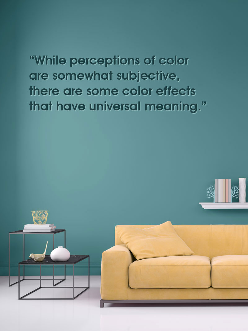 Image Credit: iStock.com/ExperienceInteriors
Color Psychology
Color psychology, as a matter of fact, is a wide-ranging field of study that covers how people tend to react to certain hues, tones, and shades, either singly or together.
Understandably, when it comes to painting your home, this is an important consideration.
It influences a great deal of popular culture, from the logos chosen for businesses and organizations, to book covers, movie posters, web sites, and every other piece of design.
Even rendering things in black and white doesn’t mean you’ve escaped from a consideration of the psychological impact of color.
There are certain colors that may be easier to agree to avoid, however. Very Well Mind notes,
Very Well Mind in an article addresses the psychology of color, also notes there are variations of color preference and color associations between genders, ages, and cultures.
So what you choose may not appeal so much to someone of the opposite gender — which can sometimes make it difficult for husbands and wives to agree on the shade they choose for their living room.
Warm colors, as an example, such as reds, oranges, and yellows, tend to excite the stronger emotions, such as love and anger.
So a warm yellow may impart a feeling of comfort to a homey kitchen, but a harsh red might very well create anxiety and the urge to escape.
Cooler colors, such as blues, purples, and greens, tend to have more of a calming effect on the viewer. They may also, however, be seen as rather sad and depressing, depending on the extent of their use.
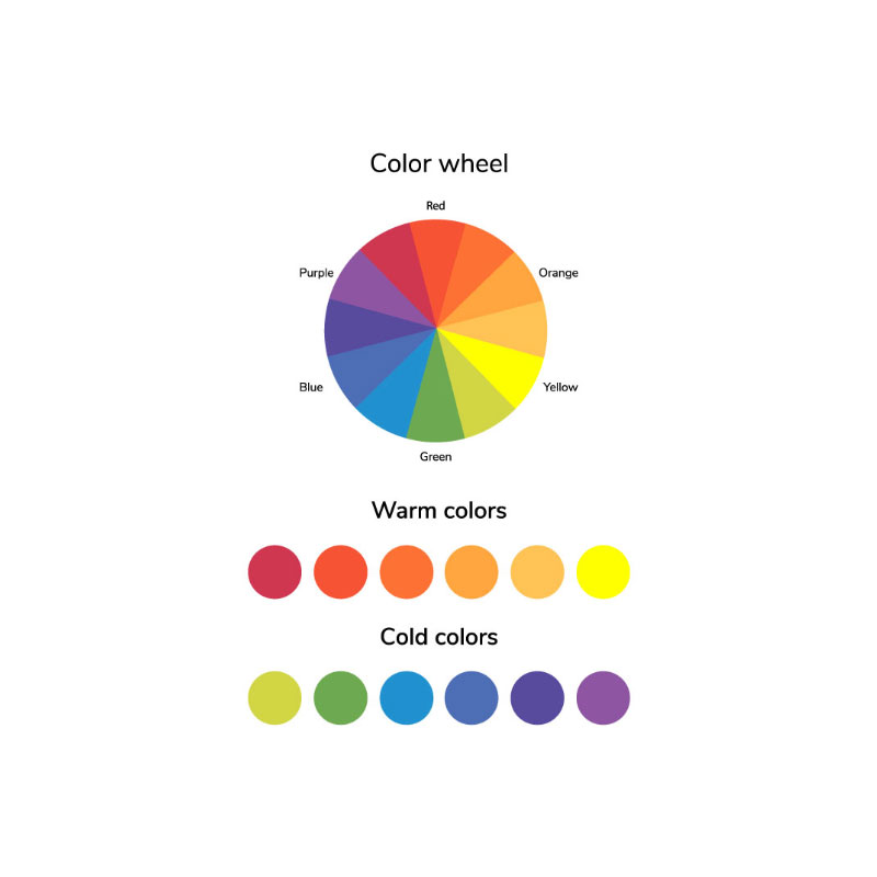 Image Credit: iStock.com/Irina Kuznetsova
You may find some hints as to which color to choose depending on what room you’re painting; for example, according to ColorPsychology.org notes that blue is a color that has the effect of orderliness, mental clarity and improves productivity. It also has a calming effect, and has been shown to lower pulse rate and even the temperature of your body. It’s therefore ideal for the workplace.
The Detailed Psychology Of Color
Here is a brief rundown of some of the predominant emotions attached to individual colors, in terms of paint color choice.
- Blue is a calming, soothing color that is also seen as stabilizing and reliable.
- Green is also soothing, as well as inspirational and stress-relieving for many.
- Purple is seen as a noble, elegant color that elevates a color scheme.
- Yellow is warm, attention-getting, and cheerful, but can also be aggressive and overbearing.
- Red is an energetic color that can really liven up a theme, when used in moderation. Overuse can result in anxiety.
- Black is seen as fashionable and stylish in conjunction with other colors, but when used too much in paint or design can become depressing or morbid.
- White is also stylish, as well as seeming clean and uncomplicated. But a predominately-white house without any accenting colors can seem stark and sterile.
So now that you have a very basic basis for the psychology of color, how do you go about choosing the actual shade?
 Image Credit: iStock.com/NNehring
Resources, Inspirations, Color Wheels, And Pantone
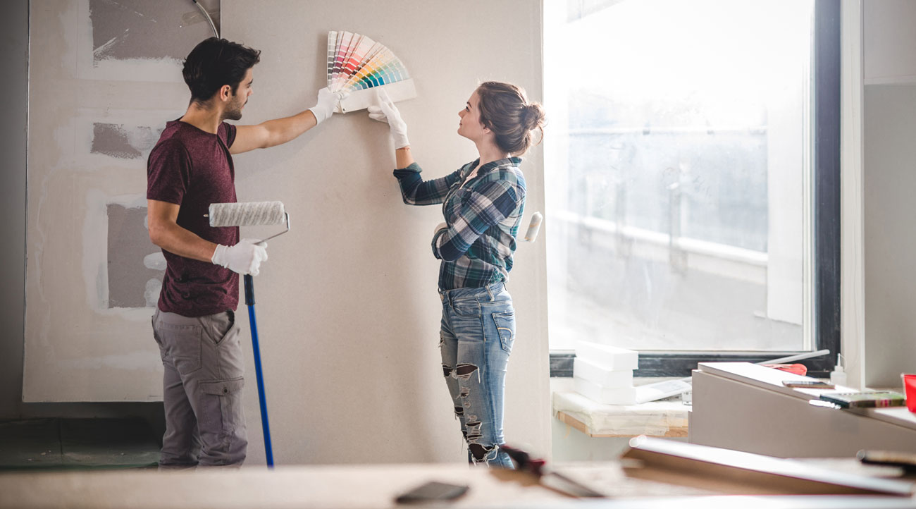
A good place to start is with decoration inspiration, such as via Pinterest or Instagram. Typing in “house painting ideas” or “room painting ideas” and browsing what others have done may get you in the mood for making some decisions of your own.
What about choosing specific colors? Especially choosing colors that play well together?
A good old-fashioned color wheel may be your friend here.
Apart from giving you an overall view of more basic colors, it also highlights colors that contrast well next to others. Typically, color wheels are based on primary colors, secondary colors, and tertiary colors. The second and third of these are formed by mixing the others, either primaries together, or primaries and secondaries.
Viewing the colors on the color wheel gives you a better idea of the base colors, which in turn may help you determine what colors will work well with each other.
Using color matching systems such as Pantone allows you to work with a standardized base of colors.
This means that if you use a certain Pantone color ordered from a certain paint supply store, and later have to order it from a different store, you can use the Pantone code or color name with the new store and not worry about whether it will match or not. Both stores will run off the Pantone Color Matching System.
Popular Colors
Pantone also chooses a Pantone Color of the Year. Starting in 2005, the company began to elect a certain color based on “ascending color trends,” among other things, according to the Executive Director of the Pantone Color Institute.
The color is chosen by representatives of the color standards groups of a variety of nations, giving each color a solid global appeal.
 Image Credit: iStock.com/humonia
Other institutes and paint brands choose “color of the year” as well, resulting in a wave of color trends across fashion and design with each changing season.
You may have noticed that certain colors are “in” one season, and out the next. While it’s unlikely that your house paint will be as fickle as the current style, the “hot” colors that are trending may strike a chord that moves you to choose that particular tone for your living room.
According to Elle Magazine’s home decor department, some of the top trends for this year include “energizing corals,” which work along with Pantone’s Color of the Year, Living Coral.
Another trend is dark hunter green, which has the benefit of feeling outdoorsy and woodsy, close to nature, while still being gender neutral.
Also trending are jewel toned accents, which can add a pop of color to the always popular neutrals: blush, mushroom, beige, and cream.
Helpful Color Matching Apps
Have you stumbled across the perfect color in nature, in the middle of a store, or in the depths of your child’s eyes? How on earth are you supposed to figure out what color that is?
Obviously, you aren’t the only person who has ever had this problem, because there are a number of apps that actually were created to help solve it.
These apps are designed to allow you to take a picture of wherever you’ve found the perfect shade. Then, the app will spin the color wheel til it finds the closest matches, allowing you to take the name/number in to your local paint store and order it up.
These apps do tend to be designed by individual paint companies, so it may be a good idea to download a few of them and run your color through each to see which one matches up for you closest, in terms not only of shade but also of price and quality.
Usage Of Paint Colors
Not all colors are created equal, and neither are all rooms of the house. While you may choose to paint your child’s bedroom electric blue, you probably aren’t going to want to carry that motif throughout the rest of your home.
Certain paint colors do lend themselves to certain spaces. Here are a few tips on using paint colors in different areas of the house.
- In small spaces, opt for lighter colors to add a feeling of openness. Dark colors in small rooms close the space up even further.
- In rooms like the kitchen, opt for warm colors, or at least warm accents. We typically want our kitchens to feel cozy and welcoming, so yellows are a classic choice.
 Image Credit: iStock.com/ExperienceInteriors
- Take note of which rooms in the house are visible from other rooms. If you have a large, open floor plan space, you’re probably going to want to choose colors that are similar or which contrast nicely, avoiding anything that clashes within that space.
- Choose a color for the main room of the house, and build your palette around it.
 Image Credit: iStock.com/ExperienceInteriors
Paint Types
There are a variety of types of interior paint to consider, on top of just choosing the colors you’ll be working with.
Each has their purpose.
The general rules to remember: the shinier the paint finish is, the more any imperfections will show; and also, the longer it will take to dry.
- Primer. This is applied first to give a base coat to an interior wall, helping to cover up imperfections and letting the color of the main coat show true. For lighter colors, use a pale primer. For darker colors, you may choose a grey or neutral tone primer.
- Matte finish. This interior wall paint choice is actually the most commonly found paint type for interior decorating. As the name suggests, it’s matte — there’s no sheen or shine to the paint. It’s easy to apply with a brush or a roller, and covers well. However, if you have kids or dogs, you should keep in mind that matte paint is easy to mark, and not always easy to clean.
- Matte enamel finish. Very similar to a plain matte finish, this paint has the advantage of an enamel-like aspect to it, which makes it much easier to wipe down when it is marked.
- Satin finish. This finish is somewhere in between a gloss and a matte, which gives it a slight sheen. It’s easy to clean, but gives a thinner coverage, which makes any imperfections or holes in the wall stand out even more.
- Eggshell finish. Similar to satin, except with a duller, softer sheen. It’s also easy to wipe clean, and doesn’t highlight problems with the wall as much as a satin finish paint.
- Semi-gloss finish. This paint is thicker and more durable, meaning it can cover more with just one coat. It doesn’t quite have a full gloss tack to it, but it is easy to clean with soap and water. It’s often used on wood, such as trim.
- Gloss finish. Gloss is the second most common choice for interior wall paint after a matte finish. It has a high shine and cleans well, but shows imperfections. It’s also commonly used on trim and other wood features.
- Textured paint. This paint gives some dimension to your walls, allowing you to move beyond the typical finishes. Typically you can choose from options like stone, sand, and faux finish.
- Emulsion paint. This is a water-based paint, with vinyl or acrylic added for longer lasting durability. It comes in several finishes.
- Clay, chalk, or milk paints. These options don’t contain the same acrylics and chemicals that traditional paint does, and so they are more environmentally friendly. They’re matte finish, and tend to be earthy, more neutral tones.
Things To Consider When Choosing A Paint Color
On top of the psychology of color, the size of the space, and the type of paint, there are a few other things to take into consideration when you’re putting your color palette together.
Natural Light
The lighting in each individual room will alter how your color choice looks, depending on the time of day.
If you have small windows and less natural lighting, move up into a lighter shade of your color of choice.
Overall Mood
If you or a member of your family has a tendency towards depression or anxiety, choosing colors that are soothing and uplifting can help a great deal.
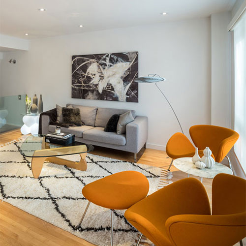 Image Credit: iStock.com/Sisoje
After all, you have to live with the colors you choose; if anxiety is a problem, opt for soothing blues and greens and cooler colors.
However, if depression is a consideration, it’s best to avoid blues, as they can exacerbate the problem.
Quality of Paint
How often are you planning on painting your rooms?
For some of us, it may be more often than we might think — sometimes, just changing up the room’s decor a little makes it easier to live with.
But for most of us, we’d rather hold off on painting as long as possible. If that’s the case with you, opt for a higher quality paint which offers durability and a longer lifetime.
 Image Credit: iStock.com/Ridofranz
Tips For Painters
If you’re painting for someone else, you may not have the luxury of choosing the colors. But then again, if you’re a professional, your client may very well ask for your input.
So what do you tell them?
Consider what you would do if it were your own home.
- Think about the family, the “mood” of the house, and the space involved.
- Check to see what rooms are visible from other rooms, especially from the living room.
- Steer away from huge, bold painting decisions. It may be what you would choose, but it isn’t always worth the risk to choose it for someone else.
- What furniture, flooring, paintings, and other features of the house will the paint be a backdrop for?
- Will the paint color clash with any of the owner’s belongings?
Tips For Homeowners
In addition to the tips above for professional painters, there are a few other suggestions for a homeowner who is into DIY.
Don’t put all your eggs in one basket, and don’t put all your trust in a paint swatch. It’s going to look different on a little square of paper than it will on the wall — trust us on this.
Remember that the tendency is for colors to end up a bit darker on the wall than they are on the swatch, so if you’re determined not to test it out, opt for a lighter shade rather than darker.
But really — test it out.
Ask for samples from your local paint store — they’re unlikely to be more than three dollars or so — and paint small sections of the wall to test out your color options. It’s a wise idea to choose three favorite options to compare.
 Image Credit: iStock.com/Bill Oxford
Seek out feedback from others. This could be your family, your housemates, random strangers on the street — get an opinion on what works and what doesn’t, and why.
That said, don’t just go by what others tell you. It’s your house, after all, and you’re going to have to live with the color.
Remember the old saying, different strokes for different folks. You may truly love a certain color, but not everyone is going to agree with you. And that’s perfectly fine; color choice is all about individualism, creativity, and speaking to the inner person.
Other Considerations For Homeowners
DIY may not be your thing. If that’s the case, here are some facts and tips for you.
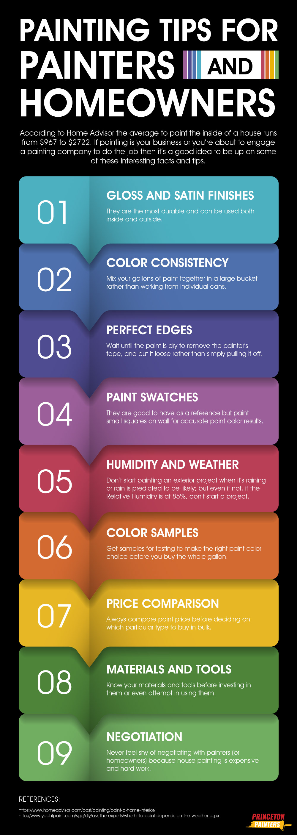
- According to Home Advisor the average to paint the inside of a house runs from $967 to $2722.
- Shop around before deciding on a painter. Ask for estimates, check for references and previous work done, and insist on a contract.
- If you’re not wanting to completely DIY but you’re leery of hiring a stranger, consider asking around for help with your painting projects. Many of us have friends that don’t mind spending a few days helping out, whether for a little extra cash or for free pizza and beer.
- Know what materials and tools you need, and be prepared. There’s nothing worse than opening up the can of paint and discovering that you need a new cutting-in brush before you can do anything, or getting ready to paint and forgetting that you haven’t taped the ceiling off yet.
Painting — From Color Choice To Finishing Touches
As you go through your painting journey, from finding inspiration to getting feedback to actually doing the work, you’ll probably find something interesting: it wasn’t nearly as big a deal as you thought.
In fact, by the time you’re done, you may very well be wondering what all the fuss was about, why you had to read an article on the subject, and why you didn’t do this months or even years ago.
In all fairness, painting can be very intimidating on the semi-gloss face of it. Especially if it’s a matter of tackling a big project, like the entirety of the interior of your house.
Hopefully, with the tips and information in this article, you’re already well on your way to the feeling of a job well done.
Happy painting!